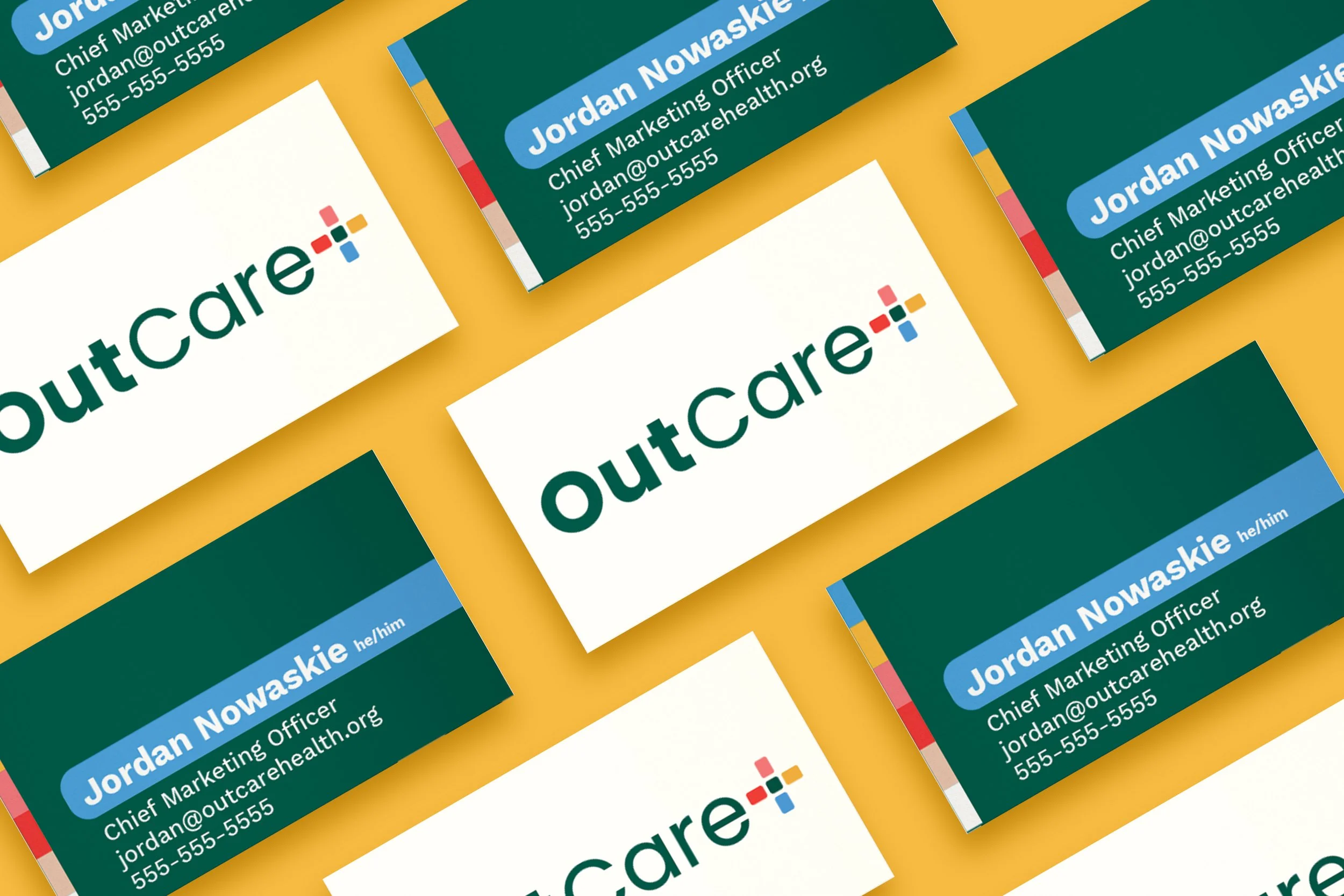
Design | Tagline | Logo | Social | Web | Merch
outcare health
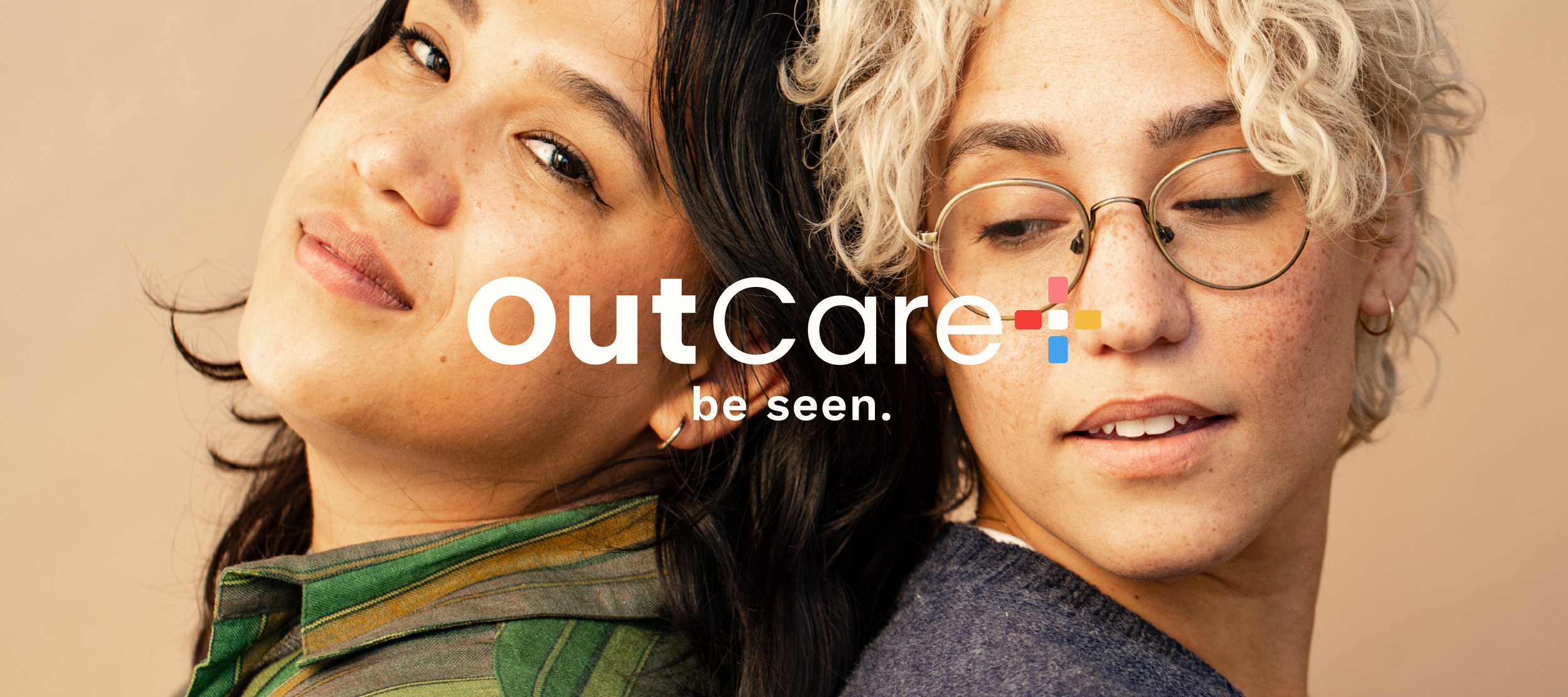
When someone goes to the doctor, they shouldn’t be afraid of judgement or discrimination. They shouldn’t feel ignored or misunderstood. Unfortunately, for many in our LGBTQ+ communities, this is something they face all too often.
OutCare Health is creating a more modern way to care for all patients. For inclusive and affirming care for for all LGBTQ+ communities, and a standard for everyone in healthcare.
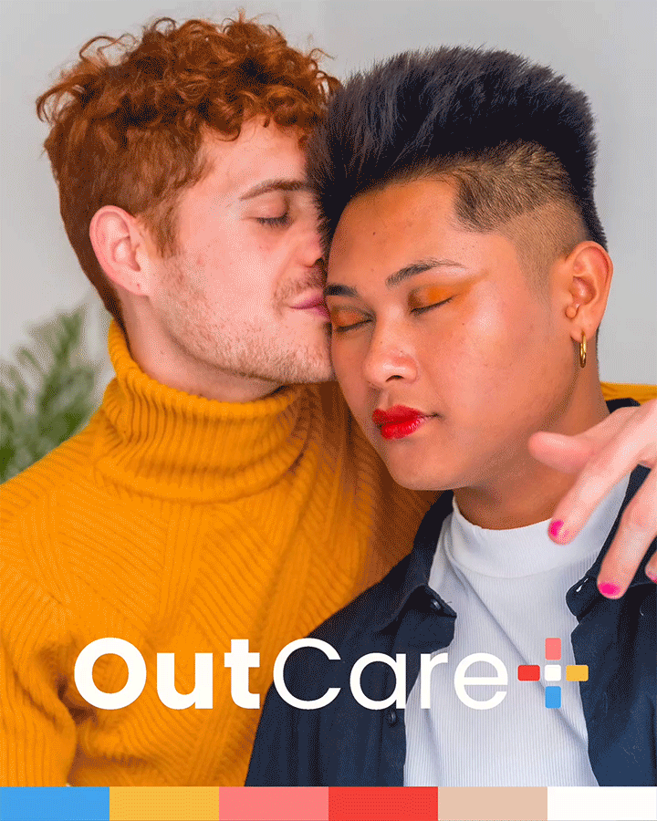
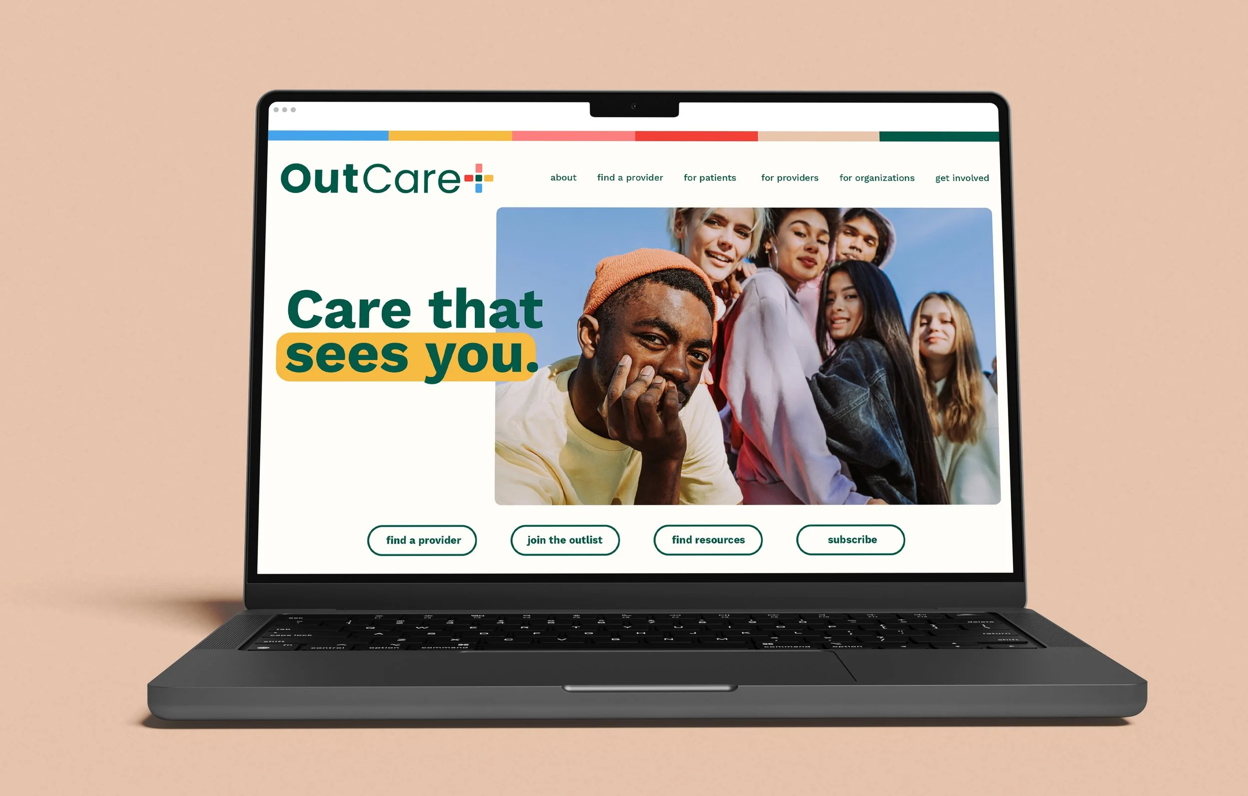
My team at Fortnight Collective had the great opportunity to rebrand OutCare in celebration of their 10th anniversary, which included updating their original logo, selecting an inclusive and differentiating, new color palette and creating the brand’s first-ever tagline, Be Seen.
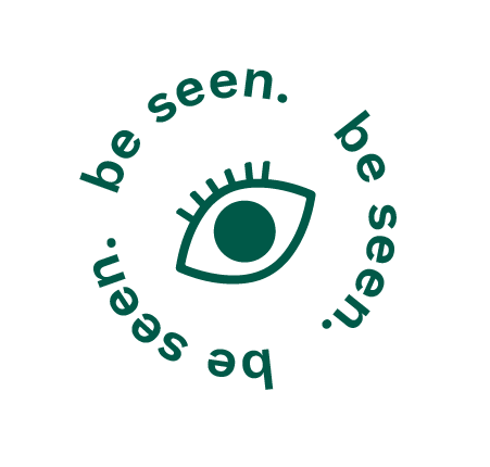
be seen
Press Release: OutCare Health Unveils Bold New Brand
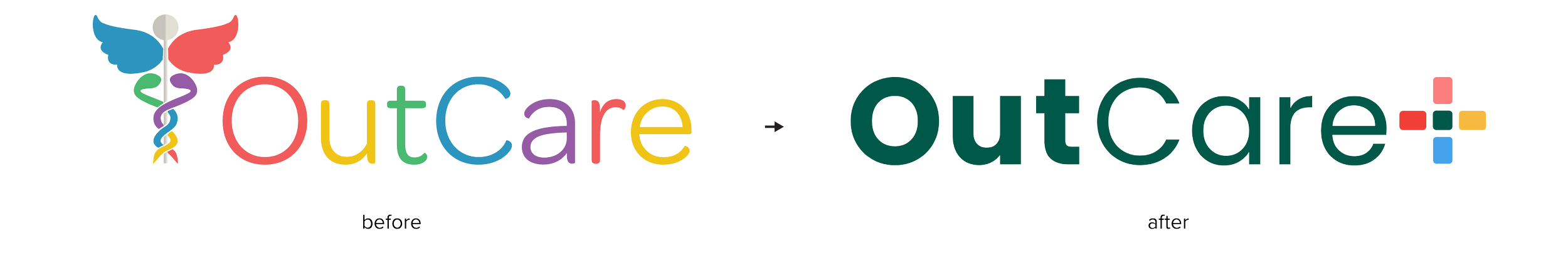
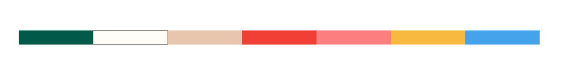
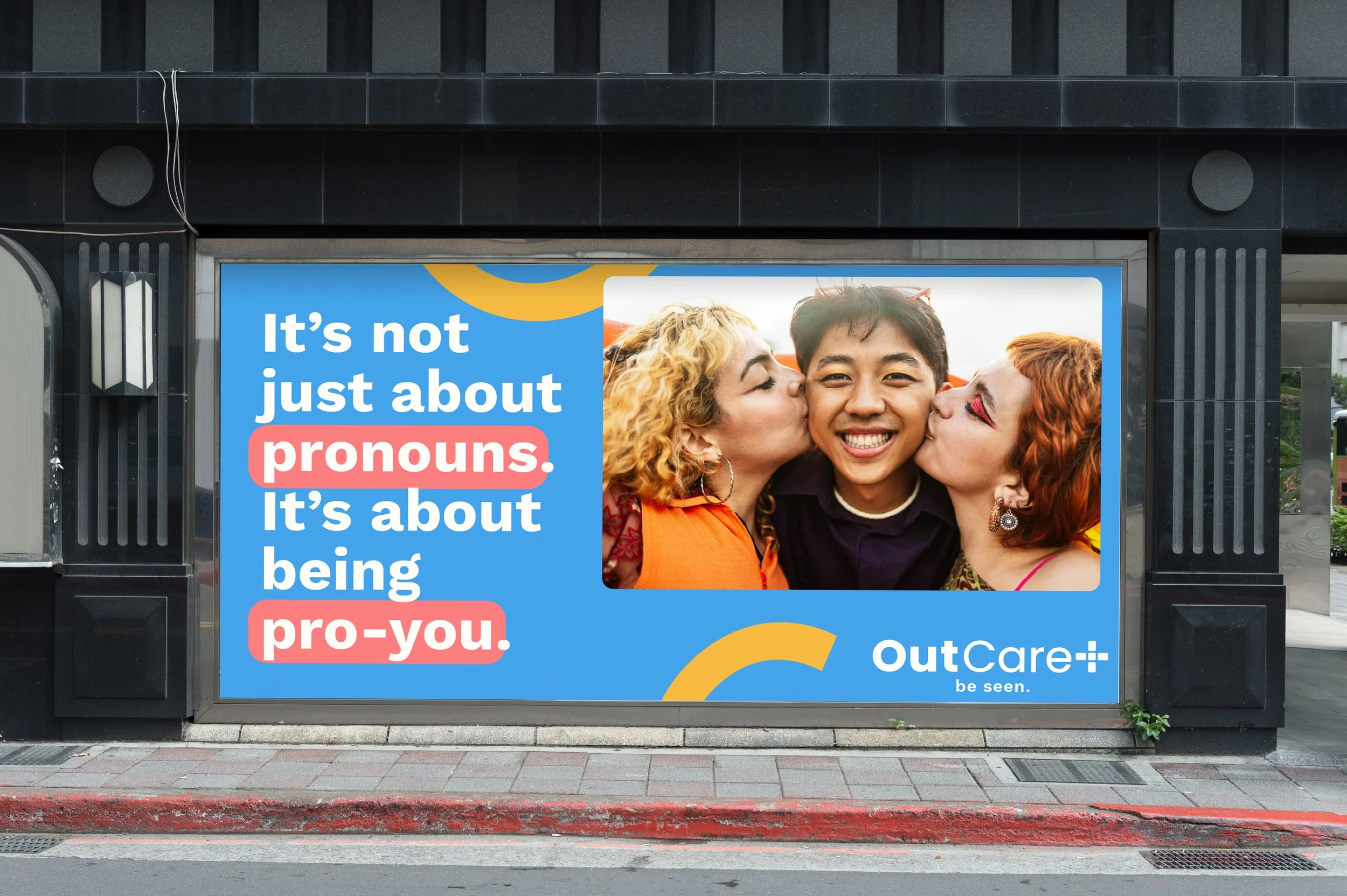
We crafted a logo that’s rooted in the healthcare space, yet colorful and bold. Since OutCare is a 10 year old company and a pioneer in the space, we strategically moved away from typical pride colors and opted into a more sophisticated, yet still optimistic and playful color palette that stands out amongst other healthcare brands.
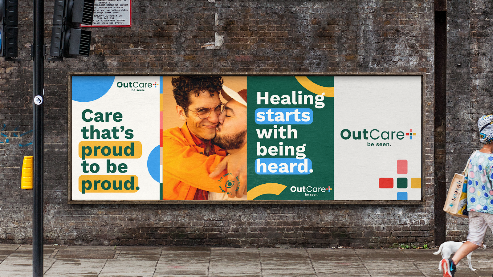
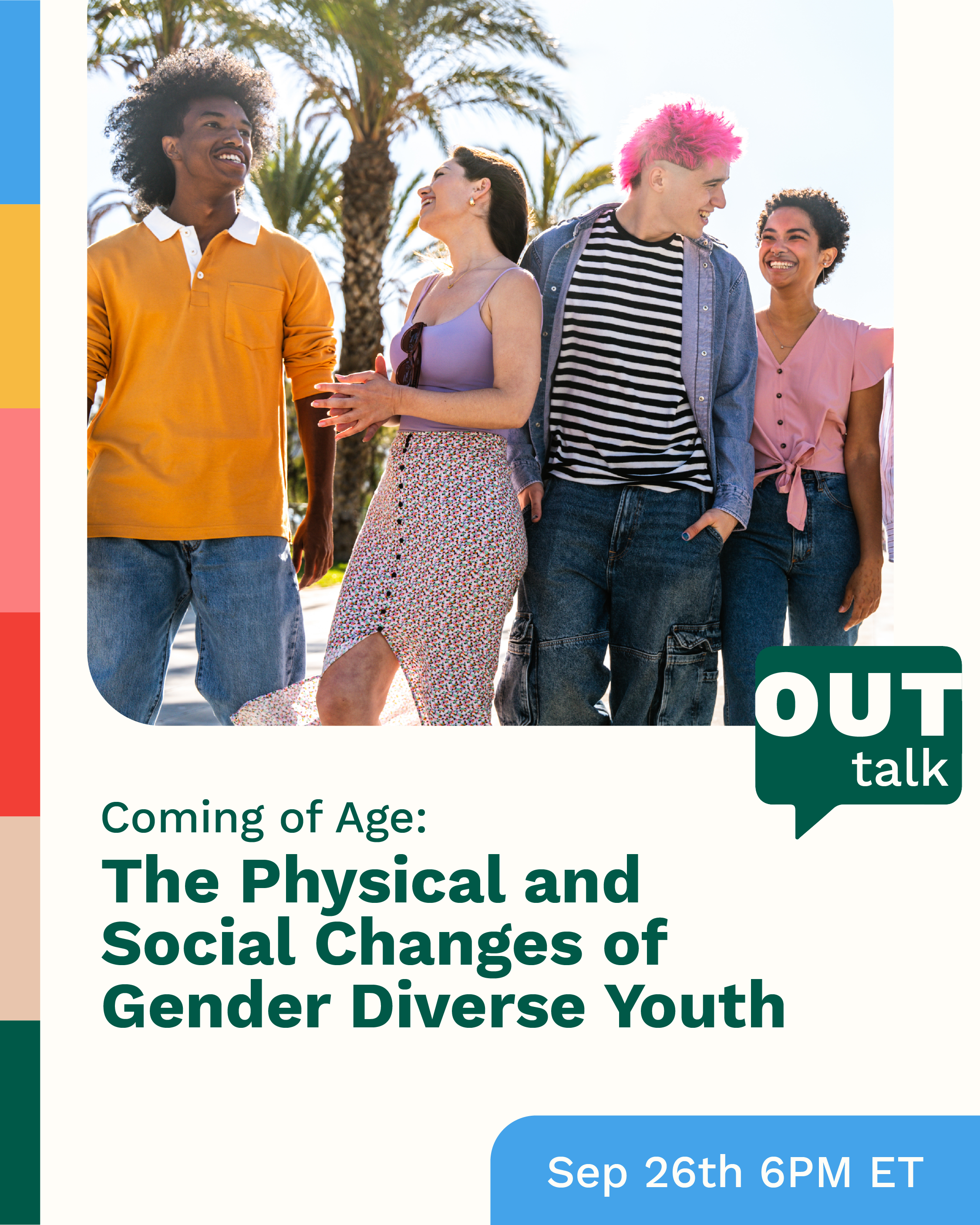
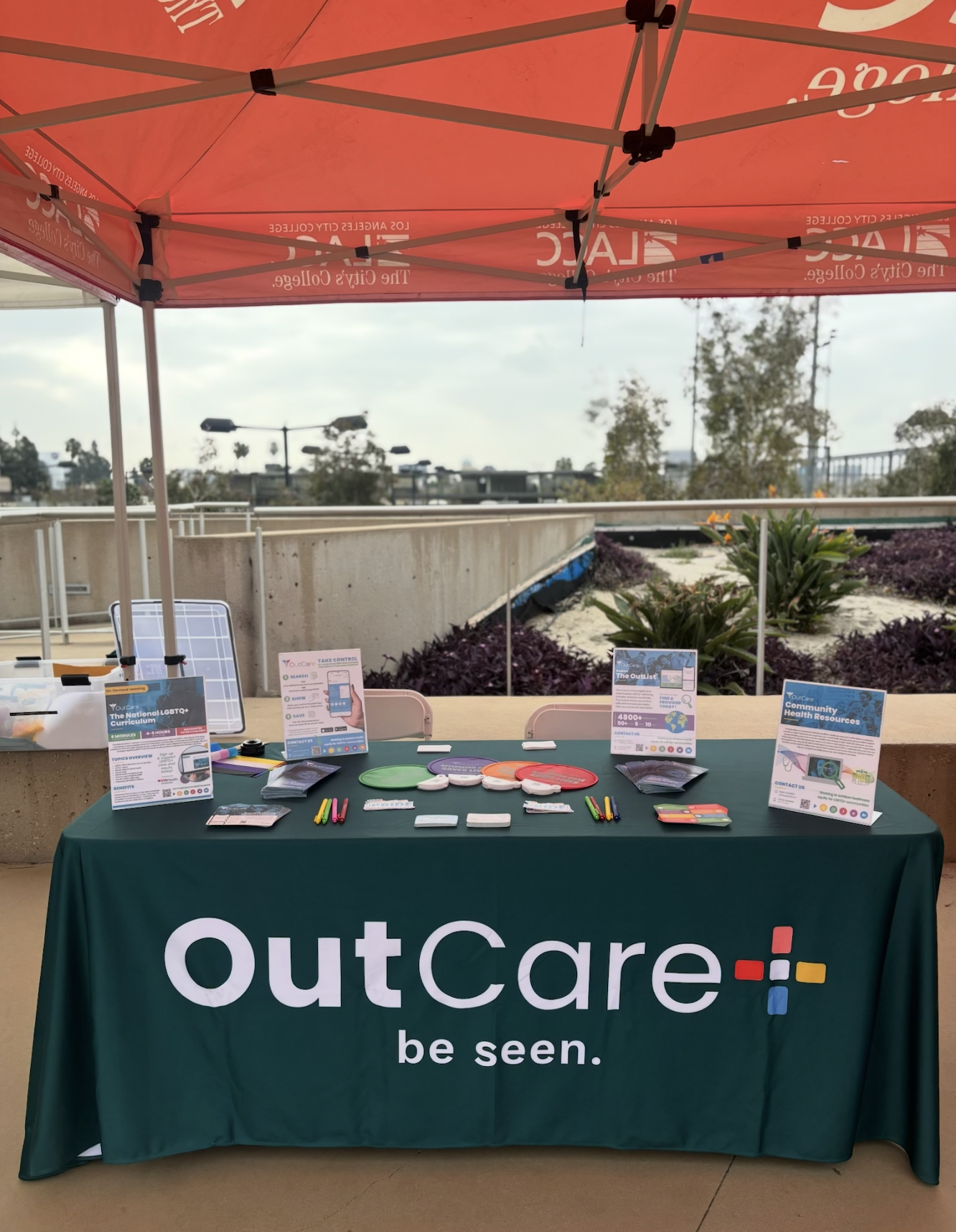
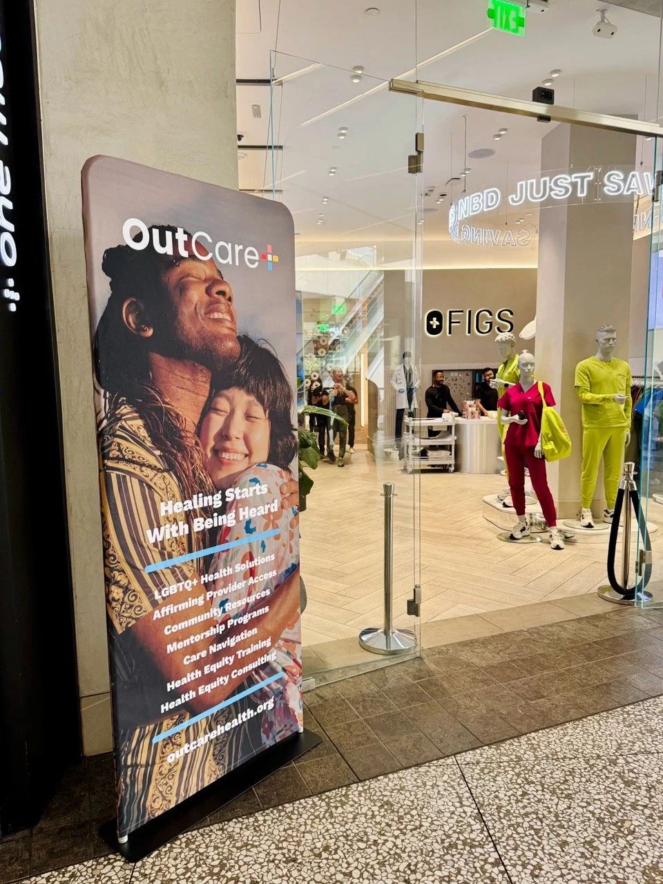
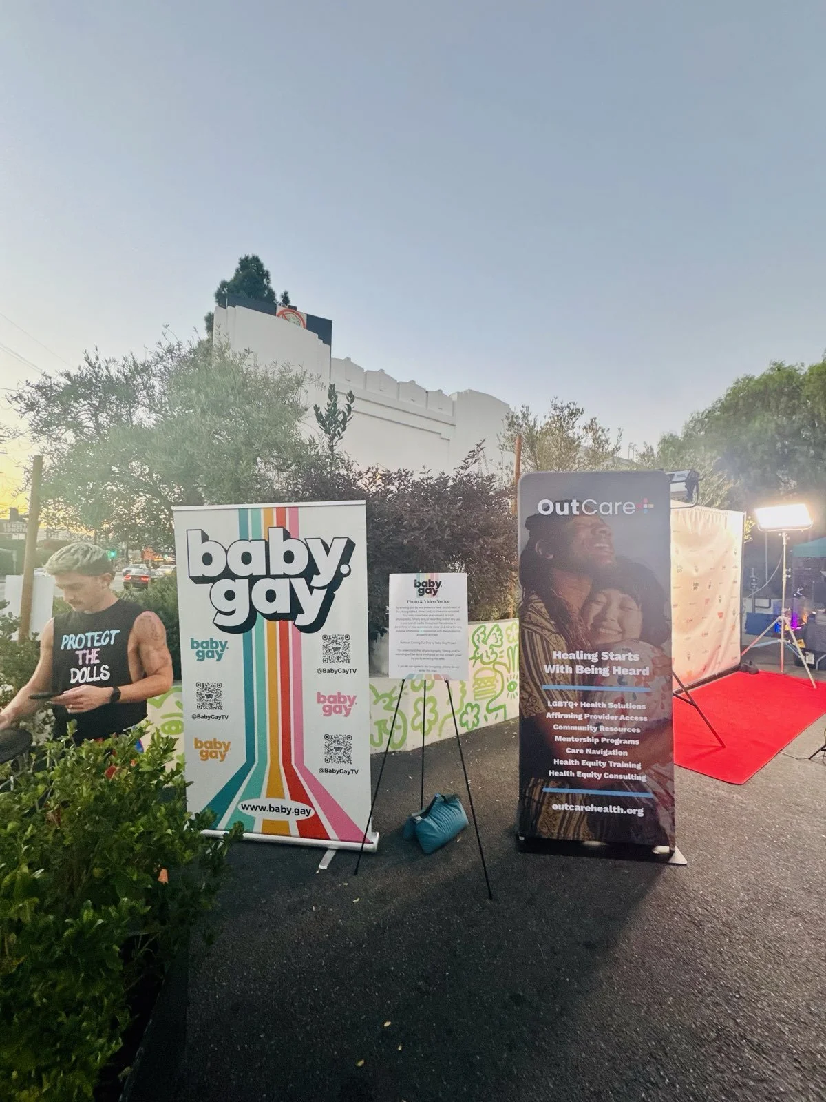
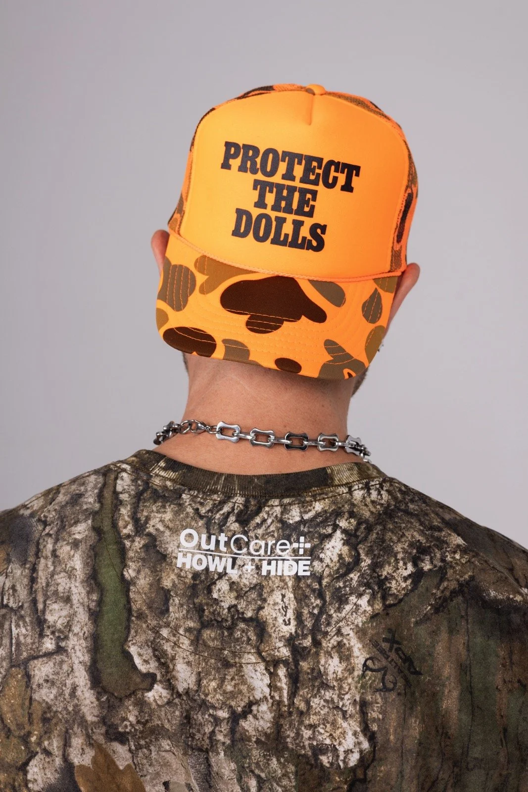
Outcare in the wild
It’s been incredible to see OutCare starting to rollout the rebrand IRL.
Credits
Client: OutCare Health
Agency: Fortnight Collective
Role: ACD Art Director / Designer
Team
CW / CD: Mona Hasan
AD / ACD: Steph Strange
Strategy: Sam Emrich